Matplotlib is known for its visual data representation capabilities. It is the most well-known data visualization library in Python. Its popularity lies in its customization option. There is a wide range of methods programmers, and data analysts can use to tweak the graphical representation. In this article, you will learn about setting the axis (x-axis and y-axis) range using the xlim() and ylim().
Creating the Plot using Matplotlib:
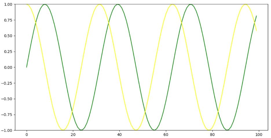
Let us now create a graph with the sine and cosine waves before jumping straight into the X-limit and Y-Limit.
Program:
import matplotlib.pyplot as mpl
import numpy as np
fig, ax = mpl.subplots(figsize=(12, 6))
x = np.arange(0, 20, 0.2)
a = np.sin(x)
b = np.cos(x)
ax.plot(a, color='green')
ax.plot(b, color='yellow')
mpl.show()
Explanation:
First we import the matplotlib.pyplot with an alias name mpl. Also, we have to import the numpy with an alias name np. Then we have to assign the two variables fig and ax with the subplot() method and passing the figure size withini it.
Next, we use the arange() method with a starting value as 0 and an ending value as 19 and a step size of 0.2 and assigned it to he variable x. next, we used the sin() method of the numpy to define the sine graph and passed the variable x within it.
Similarly, we have used the cos() method of the numpy to define the cosine graph. Now, we use the plot() method to draw the line of a (for sine) and b (for cosine) with green and yellow color respectively. Finally the mpl.show() will make the graph display in the output.
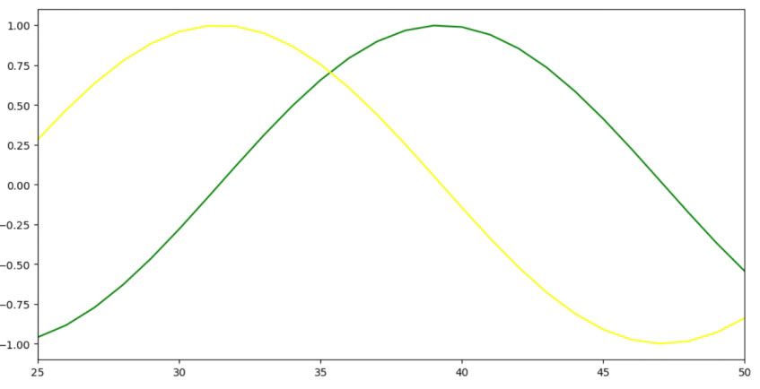
xlim(): It is a predefined method of the Pyplot module under the Matplotlib library. It allows to prepare or set the x-limits of the current axis. As the name suggests, it limits your view to that fixed set of units residing in the x axis.
The syntax for xlim() is:
matplotlib.pyplot.xlim(left-most argument, rightmost argument, **kwargs)
This method takes majorly three parameters described below:
- Left-most parameter: The left parameter is used to set the maximum xlim value to left.
- right-most parameter: The right parameter is used to set the maximum xlim value to right.
- **kwargs: It accepts the text properties used for controling the label’s appearance.
Program:
import matplotlib.pyplot as mpl
import numpy as np
fig, ax = mpl.subplots(figsize=(12, 6))
x = np.arange(0, 20, 0.2)
a = np.sin(x)
b = np.cos(x)
ax.plot(a, color='green')
ax.plot(b, color='yellow')
mpl.xlim([25, 50])
mpl.show()
Explanation:
The same code has been followed from the previous code. The only additional code done is the mpl.xlim([25, 50]). It defines the x-axis limit with the units of values to be displayed through the graph. Therefore, instead of showing the graph from 0, it will now show the particular graph from 25 up to 50.
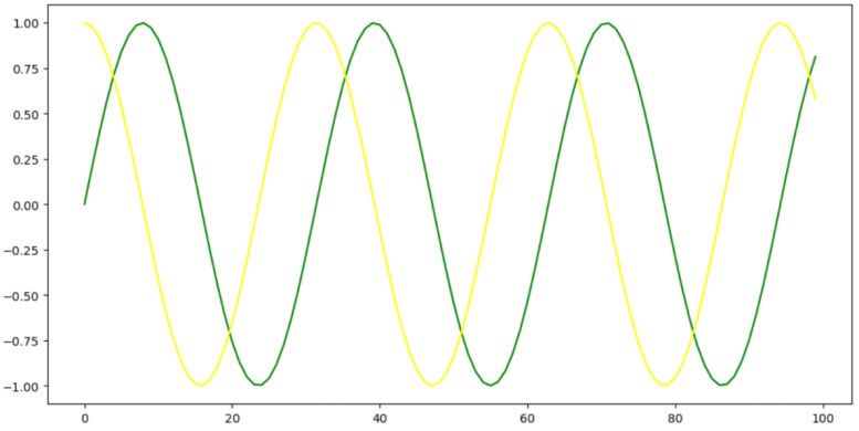
ylim():It is a predefined method of the Pyplot module under the Matplotlib library. It allows to prepare or set the y-limits of the current axis. As the name suggests, it limits your view to that fixed set of units residing in the y axis.
The syntax for ylim() is:
matplotlib.pyplot.ylim(bottom argument, top argument, **kwargs)
This method takes majorly three parameters described below:
- bottom parameter: The bottom parameter is used to set the minimum y-limit value downward towards the y axis.
- top parameter: The top parameter is used to set the maximum x-limit value upward towards the y axis.
- **kwargs: It accepts the text properties used for controling the label’s appearance.
Program:
import matplotlib.pyplot as mpl
import numpy as np
fig, ax = mpl.subplots(figsize=(12, 6))
x = np.arange(0, 20, 0.2)
a = np.sin(x)
b = np.cos(x)
ax.plot(a, color='green')
ax.plot(b, color='yellow')
mpl.ylim([-1, 1])
mpl.show()
Explanation:
The same code has been followed from the previous code. The only additional code done is the mpl.ylim([-1, 1]). It defines the y-axis limit with the units of values to be displayed through the graph. Here the lowe limit set is -1 and the upper limit set is 1. Therefore instead of showing from 0, this time your graph will show from -1 up to 1.
Conclusion:
This concept is helpful in situation where the data analyst or data visualization team needs specific detailing about a particular year or set of years, or a graph segment of any particular range. It is one of the popular technique of data visualization that segregates a specific segment of the data from the entire set of data.